Story of the Letter G
|
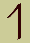
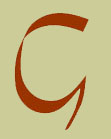
Phoenician gimel |
The Phoenician letter or pictograph gimel is the earliest known form of both the letters C and G. In converting writing from pictographic to syllabic form the letter came to indicate a soft C and a hard G sound. The Etruscans in adapting the written forms to their language confused the process and the C came to indicate a sound similar to Q and K. |
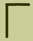
Greek gamma |
The C then became the Greek Gamma, still the third letter in the alphabet as it was in the Phoenician. the Romans, in adopting the Greek written forms to Latin, refined the characters and assigned the soft sound to the C along with the K sound, nearly eliminating the K as a letter. |
| About 230 B.C. Spurius Carvillus or Ruga, depending on your source, created the letter G as the character for the hard G sound by adding a stroke on the C. It was given the seventh position of the Roman alphabet, replacing the Z of the Greeks because the Romans had no use for it. Thus the letter G became the only character to have a known designer. Once the G was in place it gradually took on a softer J sound as well. |
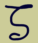
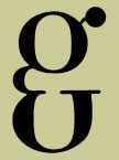
Uncial G with a beard |
The uncial form of the G began to have a more elaborate stroke, in many forms becoming the bearded lowercase G we recognize now. Later forms of the miniscule developed the beard into a tail and the influence of the Greek Gamma form in early lettering created an open form of the G. Roman cursives had a closed bowl which evolved into the lower case form we use now. |
Uncial script G which led to the lowercase form |

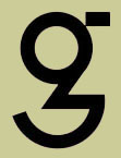
German dz version of the lowercase G |
In the 1200's an aberrant form of the miniscule G was created for the dz sound, but the letter was complicated enough already and it was abandoned. German black letter forms were often the single bowl style we see in sans serifs |
Pierre Didot's design for the lowercase G |
Pierre Didot, in what may have been a fit of sibling rivalry, created a two story lower case g with a different bowl form. This didn't catch on even after the design was knocked off by other type founders. Paul Renner experimented with a more geometric form of the letter in his early Futura drawings, only after abandoning some atrocities, but this didn't catch on either as a standard form. |
The C, which started all this, no longer had a sound of its own, and by the 1600's there were already writers who wanted to eliminate it as both the K and the S represented the C sounds. Carl’s 10 cents would then be Karl’s 10 sents. This is confusing at first, but it is more logical for English than our current practice. |
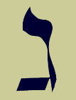
Hebrew version of |
When Paul Renner attempted to design a type based on geometry — Futura — he had great difficulty with the lowercase g. He arrived at this form which was later rejected in favor of the form we use today: a single story bowl with descender. Today we have one basic form for the upper case and two forms for the lower, the more common two story or bicameral, and the one one story or unicameral. |
Paul Renner's second version |