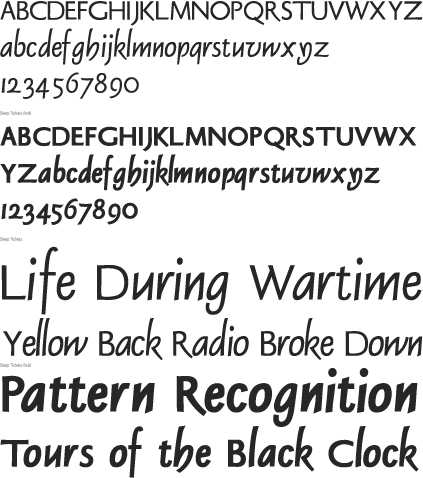
Sleep Tickets
We have always been enamored
of Georg Trump’s Delphin face and have wanted to design a sans
serif based on it. The difficult part was not making more monotone versions
of the letterforms themselves, but in deciding on how much of the original
details to keep. Trump’s design has very little sharpness to it,
the ends of strokes are generally rounded off, many in rather unique
ways. After drawing out the sans alphabet it became clear that that
detail wouldn’t work very well in a monotone sans. The letterforms
themselves are very crisp in form and the stroke ends worked better
if they were just as crisp. Rounded ends only made the letterforms look
“wormlike” and detracted from the typeface.
There are currently two weights, but I
am planning to develop a third, lighter weight as well. This is being
designed as a full OpenType font with a large character set. Expected
completion Spring of 2012.
No Bodoni Typography, the Spurius Press and Thompson Design are trademarks and projects of George Everet Thompson.
© 2011 George Everet Thompson. All Rights Reserved. Privacy policy & Licensing