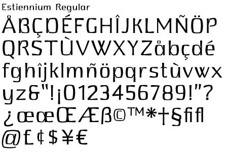
Home

Typefaces

Spurius Press

Indie Fonts II

Gutenberg's Box

Claudium

Dog Butter

Estiennium

Floridium

Isbellium

Ms Kitty

Nirvanium

ITC Oldrichium

Parma Type

Sleep Tickets

Tinman


No Bodoni Typography, the Spurius Press and Thompson Design are trademarks and projects of George E. Thompson.

Questions & comments to support@nobodoni.com
© 2003-6 No Bodoni Typography. All Rights Reserved. Privacy policy and legal stuff here.


Estiennium
Five weights, Roman & Italic

MyFonts.com

Available in PostScript for Mac,
TrueType & PostScript
for Windows

     Estiennium is a humanist sans serif with a quirky personality. The design began with the uppercase O, which was originally drawn as a modified super ellipse with its corners clipped off. The bowls of the uppercase and lowercase letters follow the same shape but stand off from the geometrically flared stems as if they had been slowly pulled away to show the connective tissue that binds them together.
      Estiennium is named for the first family of French printers. This was intended primarily as a text face with a series of weights—regular, demibold, bold, extrabold and black—that would allow a greater variation of weights.
      It works fine for shorter passages but don't set books in it at 12 points.